Graph Font
Styles
About typeface
Graph is an uncompromising geometric Slab Serif completely stripped of curves. Built entirely on strict straight lines and sharp chamfered corners, its octagonal skeleton delivers a highly technical and brutalist aesthetic. Reminiscent of architectural blueprints and futuristic interfaces, Graph is engineered for absolute precision. It is the perfect display typeface for tech startups, coding frameworks, cyberpunk aesthetics, gaming UI, and bold industrial branding. Strict, sharp, and unmistakably graphic.
Glyphs
Graph font design process
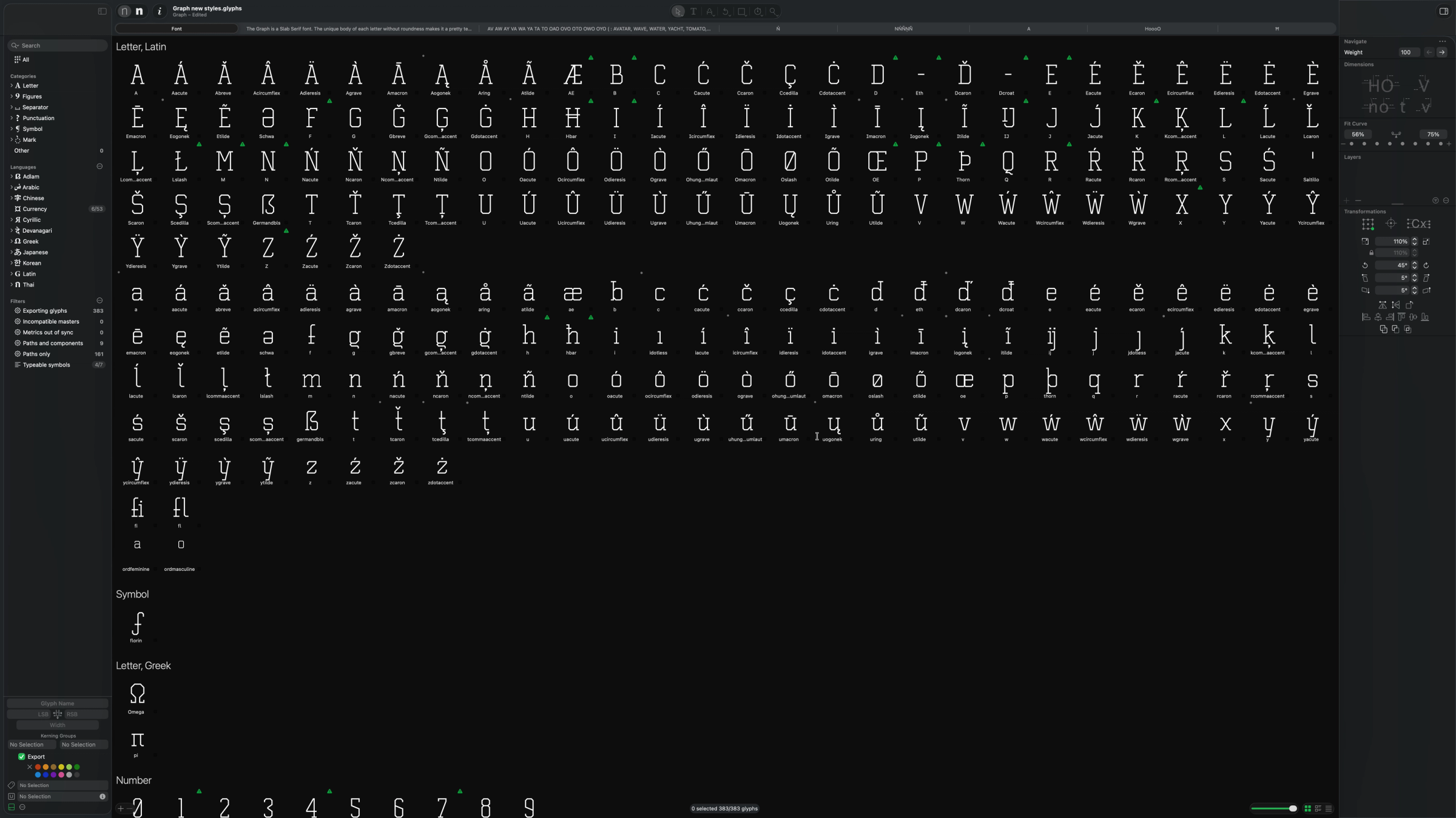
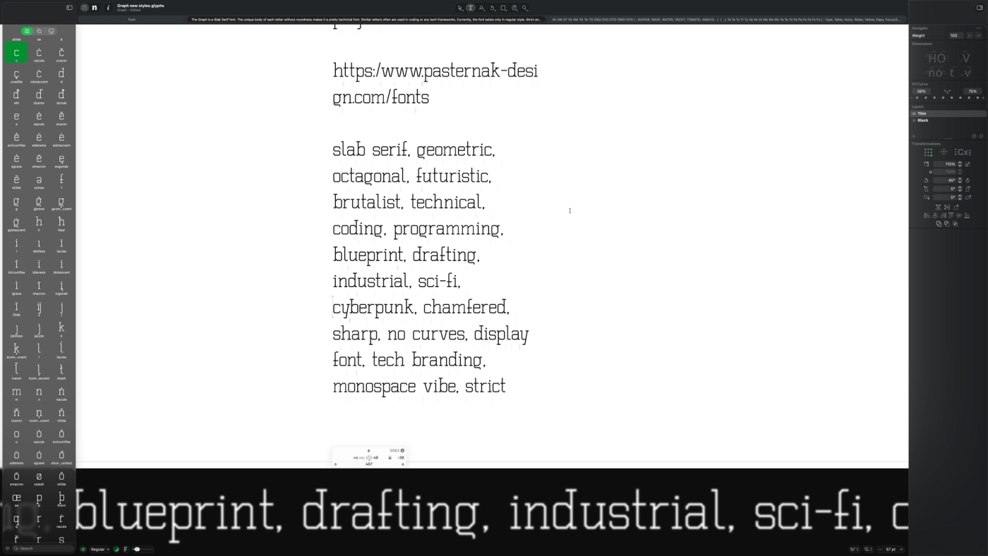
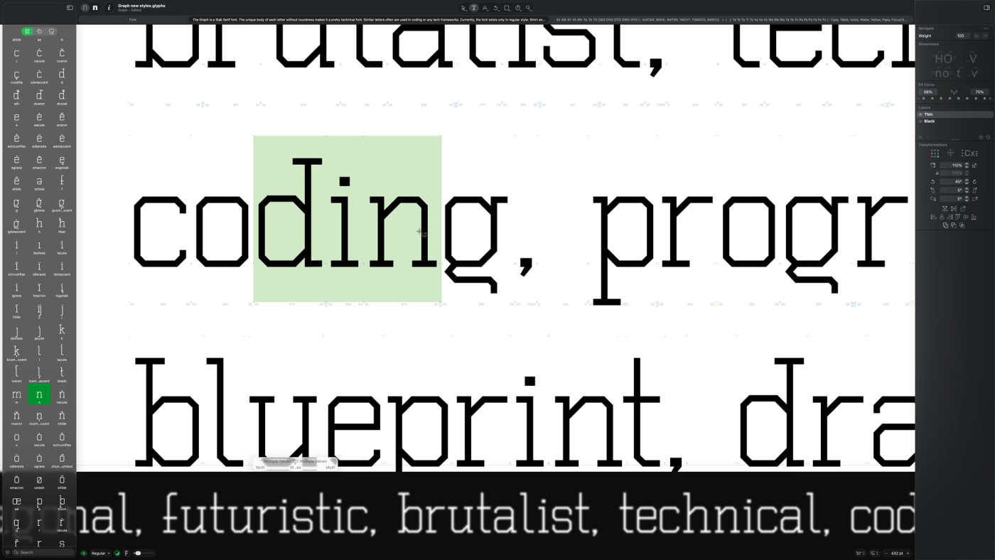
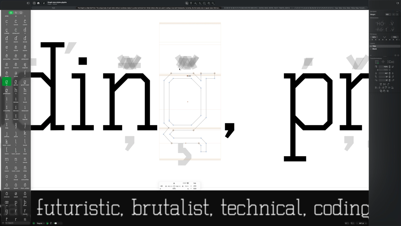
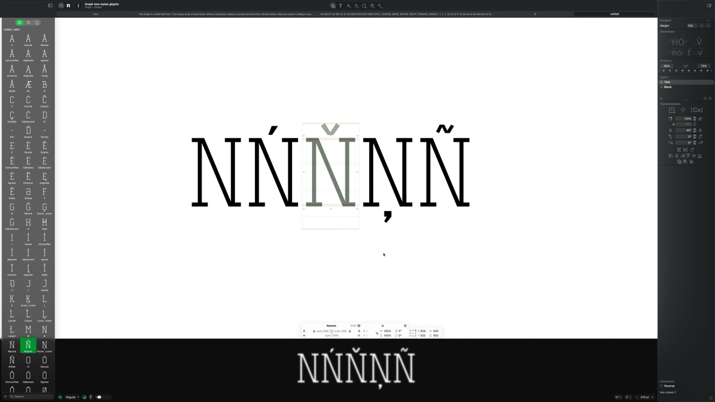
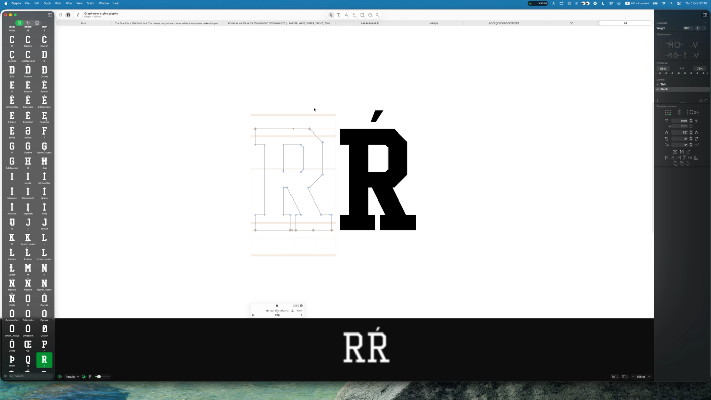
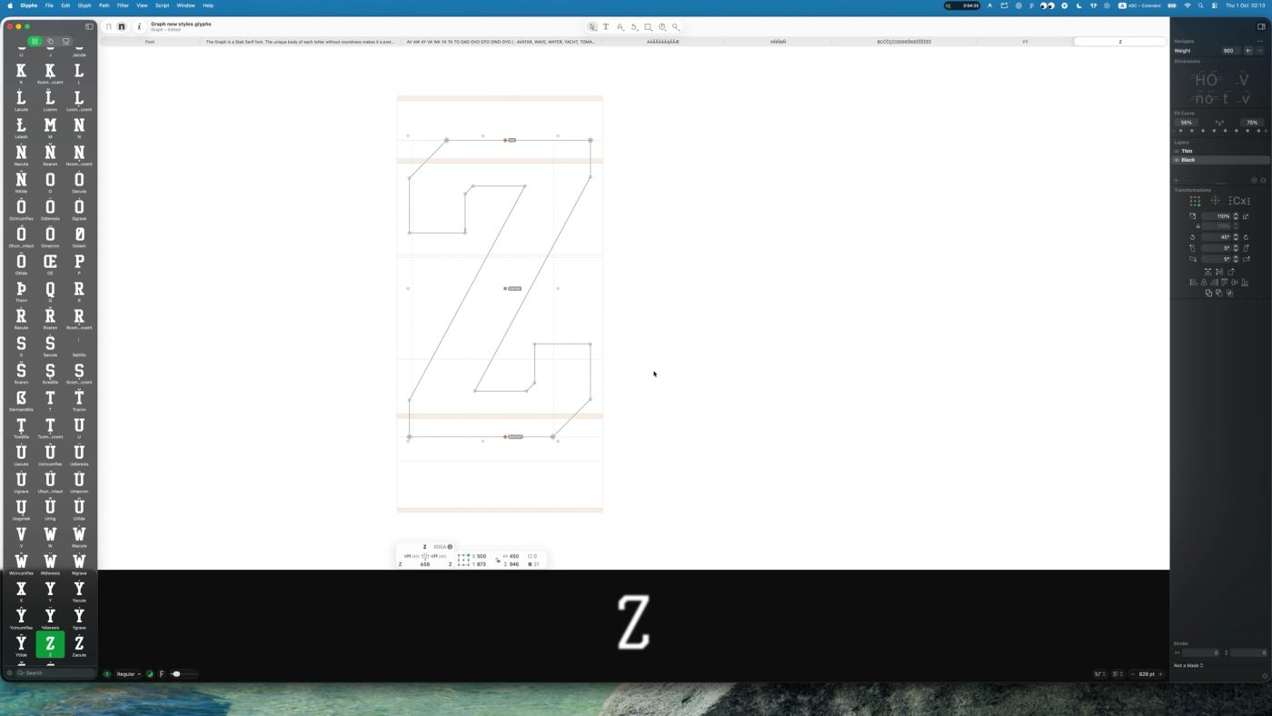
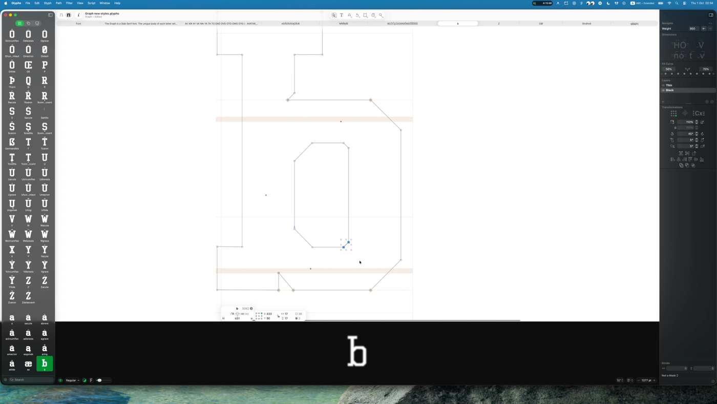
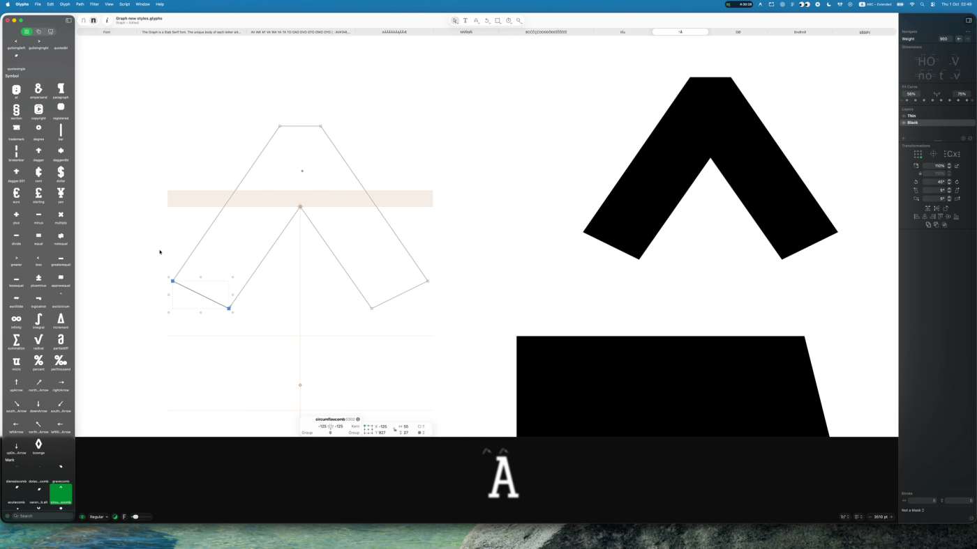
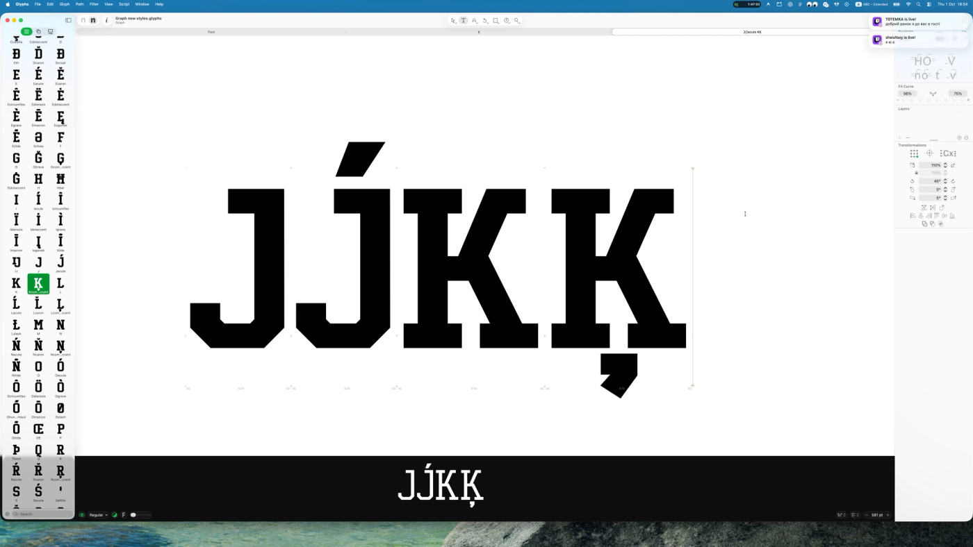
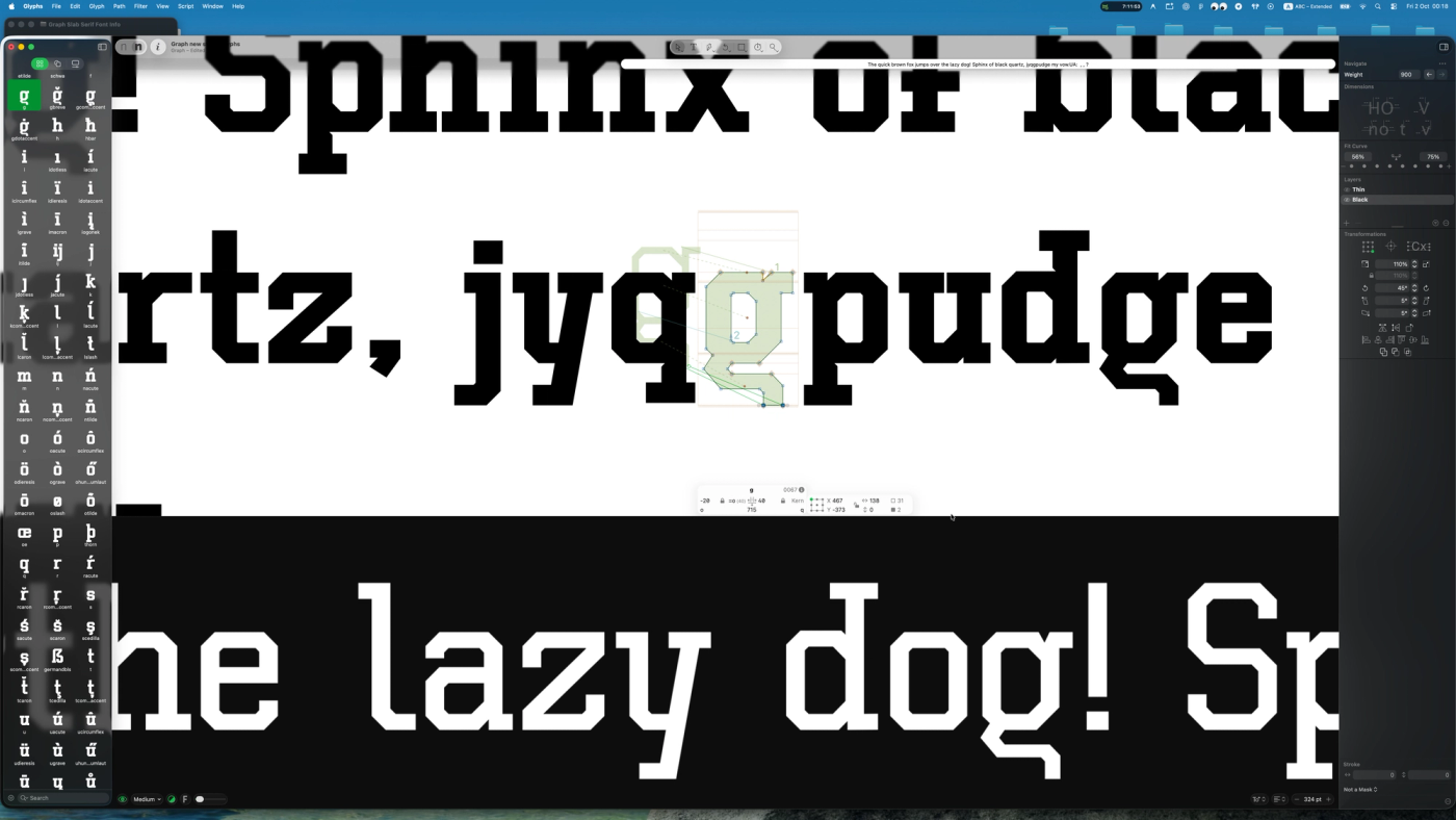
The 2026 Graph font family is a complete, ground-up evolution of the original Graph typeface first released in 2022, which initially featured only a single Graph Regular weight. Built upon the geometric DNA of its predecessor, the updated typeface was thoroughly re-engineered in Glyphs software starting from a brand-new foundational master: Graph Thin (100 weight). Every stroke was refined to achieve uniform monolinear balance, key glyphs were meticulously fine-tuned, and optical kerning was carefully calibrated. Before developing the heavier weights, all vector contours, node structures, and path directions were technically standardized. This crucial font engineering step ensures seamless, bug-free weight interpolation and flawless Variable Font performance. Once the Thin master was finalized, it was duplicated and expanded to create the opposite extreme — Graph Black — pushing stroke thickness to its maximum visual impact while preserving crisp legibility and clean counters. Using these two extreme masters, the entire multi-weight spectrum was interpolated and optically balanced, with Graph Regular serving as the core anchor of the family. Engineered according to modern OpenType best practices, the Graph typeface delivers razor-sharp rendering and effortless readability across all operating systems and digital environments — from high-resolution UI/UX interfaces and responsive web design to desktop publishing and tech branding. Designing a professional typeface is never a matter of a few evenings; it is a long, rigorous craft. It requires establishing a distinctive typographic concept, maintaining that visual identity consistently across hundreds of multilingual glyphs and diacritics, perfecting Bézier curves, and calibrating baselines, metrics, and kerning pairs. Finally, the typeface is stress-tested across real-world applications, layouts, and brand mockups — ensuring you get a versatile, production-ready font family built to elevate modern digital products and visual identities.